Thursday, March 11, 2010

Where do you get off?

Seriously. I want to know so I can add it to my list of places to never stop at. This is a short list of things that are pissing me off, but that I have to look at on a daily basis. Leave me a comment or tweet back to me if you've got something to add.  Maybe we'll write about that too, if we HATe it enough.

  1. Large-screen laptops with their touchpad and keyboard shoved way to the left. Who are the IDIOTS designing these things? It makes me uncomfortable just looking at them. The only people this could possibly be good for is Latent Lefties. You know, the kind that love them some right handed Ten-Key, but still dig using a touchpad pointing device with their left. What? You don't know any? Neither do I. When you design a computer to supposedly sit on someone's lap, it should keep the screen centered in front of you. Similarly, the keyboard should be centered, keeping your hands/arms/shoulders in a somewhat neutral position.  I'm not saying you shouldn't try to throw a numeric keypad on a laptop. I love having one on hand, but make the keys slimmer OR SOMETHING, so that I'm not reminded of this nightmare: Thanks for your "support."
  2. Smartphone Facebook Apps. I don't know which foil hat to wear here, so help me out please. When it comes to my mobile phone, I'm a moderate texter. I subscribe to many twitter and facebook friends' updates and have noticed of late, as more of my friends are switching to smart phones, that it is getting harder to reply to or interact with updates from my friends because the "app" they are using doesn't actually update their "status". I can't reply to or "like" a post via SMS because facebook doesn't support that sort of function. I get a prompt reply from facebook saying that my friend has removed this status, so I can't like or comment on it. Horse-knockers, I say! Who is trying to push me away from using SMS messages? Are we talking about the whole conglomerated smart-phone syndicate, or just the wise-asses that think I would be better served by being just slightly more connected (and billable) to the internet?
  3. Website Content Summaries. There are a lot of things I like to read on the internet. Some are informational and newsy where I may pick and choose what I want to read, and others are posted by a friend or other acquaintance such that I would not want to miss gaps in their thought-stream. It is at the friends that have chosen to literarily cock-block my usage of an RSS news reader that I have to thumb my nose. Why would you want to limit my reading pleasure in this way? I shouldn't need to go to your website to hear what you have to say, if I have a tool that will allow me to read it wherever I go. You can even throw ads into your feed, so I won't miss out on that part either. When you block the full RSS feed, it makes me think you don't really want me to read it. Is that what you want? Well then FIX it!
  4. Tweeting ONLY to link somewhere else, and then having the audacity to follow other people. Dweebs, you are useless and unoriginal. There are many of you trolling for more followers with nothing to contribute. Please cease to exist.
Blogged with the Flock Browser

Saturday, April 25, 2009

Real HATers!

Sorry to take you away from your regularly scheduled HATertainment. The following is me being serious. This is the home for HATe; a place we can rant about all the things we dislike in this world. We rant about movies, cars, and airports. But what does this really say about us? I know for a fact that most of the contributors to this blog are in fact loving and open people who happen to play HATers on the Internet. I sometimes forget that there are still people with real biases and HATred toward others in this world. I forget that not everyone is alright with others because of their skin color or sexual orientation or any number of other equally insignificant reasons.

The fact that there is HATe in this world is something I have a hard time tolerating. I was raised to value other cultures and opinions and I have a hard time even understanding how this HATred and bigotry can still exist. I try to look to the heart of each person not at their skin color or listen to their accent. I know not everyone is like me and, in fact, I love that! We can all learn from each other and become better people for it.

This weekend a very lovely man and his boyfriend were turned away from his sister’s home once her boyfriend found out one of them was black. Even before this they were told they couldn’t sleep in the same bed because they were gay. His sister allowed her partner to discriminate against her brother’s loved one. I just don’t understand this; she is open and loving or at least pretends to be, how can she raise her kids to HATe her brother and his way of life and the people he loves. Family is love and there should be no place in that for HATe. She says, that’s just the way he was brought up. I say, the man is 24 and says he knows about the world, he can shove his experience where the sun doesn’t shine. He should know that not all the things our parents tell us are true and not every opinion our parents have we need to have.

I don’t even know this bigot but I HATe him! He doesn’t know them! He can’t even comprehend that he could be wrong. His beliefs are so obviously right so therefore all the rest of us are wrong. The civil war was over long ago. I can’t believe that these racist ideas still persist

Thursday, March 12, 2009

The Best of the Old

It has been regularly coming to my attention via my Partner in HATe that I haven't been holding up my end of the bargain in helping to flesh out this website and make it something more than what has initially appeared to be an exercise in automobile HATred. After all, I've been sitting on an archived arsenal of HATe for years, ranging from political figures to Styrofoam pellets.

Nevermind that making this blog was basically an idea that spawned from my head and conveniently lumped onto kEnny's shoulders to make happen.

The problem is, Allie has only one brain, and even that one doesn't usually operate at full capacity, especially when she's writing a book. The idea of taking even a sliver of that creative energy and devoting it to this baby of ours just seemed like too much.

Well, I realized today as I was sitting on my ass goofing off on Facebook that I had no real good reason for neglecting my responsibilities. So when kEnny suggested (for maybe the 37th time) I import my juciest HATes from my garden of vitriol over at Memoirs of a Gouda, I figured there was no time like the present to Git 'r Done (I HATE that saying, by the way).

A lot of those posts are a couple years old or more, although there are a few more recent, but when a HATe is good enough and visceral enough (as with Roundabouts and Circus Peanuts), it withstands the test of time.

So click through the archives and see what's there, and let's toast to old HATes made new, and to new HATes with which we hope to grow old.

Sunday, March 1, 2009

Oh.... WOW!!!

Do you have any idea how much I'm NOT liking Blogger right now? At least it is cooperating a little bit. I know this isn't much of a first post, but this just needed to be said after all the pain and sorrow of the past week. The pondering of how to implement the features here, and those that will be here later, has been fun. The actual execution of any plans has not. It's pretty high on the HATe list right now.
Blogged with the Flock Browser

Sunday, January 4, 2009

What Makes Your (future) Car Ugly? Cadillac SRX Edition

Featured Selection from Autogotistical Carpinions

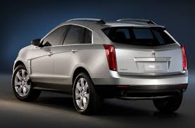
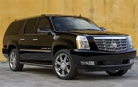
I used to like the Future/Art designs that Cadillac has been pushing for a number of years now, but when they started applying it to rebadged vehicles shared with other divisions, it just looked wrong. Case in point? Any Cadillac Escalade you see can't possibly lose the air of Tahoe/Yukon/Suburban/Avalanchiness that makes them so ermmm... common. Granted, these vehicles take a lot of work to disguise, but that doesn't mean Cadillac doesn't lose copious amounts of respect for poorly done makeovers. Today's target is a vehicle coming to a Cadillac showroom soon (if GM lasts that long), instead of a vehicle that has been out for a while.

cadillac_provoq_press_image_main.jpg

The 2010 Cadillac SRX truly embodies desperation and lack of monetary resources (which kinda reminds me of the K-car), which I can't really blame the designers for (I'm thinking management here) , but have no problem disliking nonetheless. It is singularly unoriginal in every way and has no piece it can call its own.

The original SRX (which was completely original for the US market, by the way) may look somewhat pedestrian by the current standards, but has character and individualilty wholly missing from the new model. Let's examine the sources from which the newfound ugly has been derived, shall we?

Like all the other vehicles in the Cadillac stable, the new SRX has the standard design elements that make them destinctive from GM's other brands. Unfortunately they put the Stink in distinctive this time, because they decided to borrow the same platform used for the Saturn Vue and new Chevy Equinox. While I'm not impressed with the Vue, I think the new Equinox got a change for the better, sharing more visuals with the new Traverse and Malibu than the Trailblazer it used to mirror. At least something good came out of this for the Equinox!

Just like the Equinox, the SRX features strong familial resemblances to other Cadillacs. In this case the Escaladian features are hard not to see, which only shows what a bad match this bulbous platform is for the hard edges and sharp creases featured across the Cadillac lineup.

One last item to address here is the front fender vents prominently featured on the new SRX. Where else have I seen those awesome wheel-arch decorations? Oh yes!! It was something from Ford... The Focus!!!
Blogged with the Flock Browser

Saturday, June 14, 2008

What Makes Your Car Ugly? Pontiac Aztek Edition

Featured Selection from Autogotistical Carpinions

This particular post has taken a lot of thought on my part, because I wanted to do more than just say "Hey, this car is ugly." I now live on the same block as an Aztek so I am given to dwell upon its status as an icon in the automotive industry more often than I'm comfortable with. I believe I can now say I have found the donors which have lent their genealogical makeup to this vehicle, and I can tell you that none of it is pretty.

Pontiac Aztek owners Manual
To begin with, The Aztek was a crossover. In this case that means it isn't quite a minivan. Although it can be painful to look at, the hood line is generally longer, and they scraped off some of the back to "sportify" the rear and keep the "wagon" label from attaching too firmly (this way it rather slides off). On the plus side (some may prefer using the word size instead of side), this vehicle offers a similarly commanding view of the road which has made SUVs so popular in the U.S.A. In my opinion, the Aztek begat the beginning of the end for Pontiac's styling trend taken up in the nineties, whereby they thought that they could make anything look good by adding lower body-side cladding. It worked for many of Pontiac's models, but could not help the Aztek.

The Aztek was supposed to carry on Pontiac's "outdoorsy theme" inspired by the Trans Sport Montana, which was also not very well inspired. The original Trans Sport would have been a revolution in family transportation, which I think was the only reason that Pontiac used the same name for their minivan, as it bore no other resemblance to the concept. Too bad for that. We really lost out folks, but that's nothing new where corporations are concerned.

Back to the topic at hand. Where did the Aztek really come from then? They started with the idea of appealing to folks who really needed a minivan, but couldn't own up to it. But how could they characterize these folks? What features could they add to an existing vehicle to tap a new demographic? It would need to embody independence, flexibility, and use design principles perfected in the previous 20 years. What other cars could they draw from for these elements?

You really didn't need to read this far.

Really. You will be sorry if you go any further.

Don't say I didn't warn you.


The Chevette/T1000 family of cars had been sitting idle for a few pleasant years, and were chomping at the bit to be loosed upon the world once again, so Pontiac made it taller, wider, and updated the interior to match the best in modern adventure vehicles, but kept the same basic shape. There had been previous exeriments with turning standard Chevettes into exciting vehicles, but they were usually panned due to poor placement of bottle openers under the hood.

So we have the basic outline of the vehicle, but what could Pontiac do to keep the masses from exclaiming that they had just seen the Chevette reborn? They had to find a way to disguise it so that nobody would realize what it really was. Unfortunately they drew inspiration from a shining example of movie-making: National Lampoon's Vacation. I'm sure we'll never know the true reasons for doing this, but I'm certainly looking forward to the next car they try to sell with the same styling cues as the Griswold's wagon.

Wait. I think somebody already did. Does this look familiar? I think it might. If you look closely you can see the redundant set of tail lights that accent a very similar rear facia featured on the Lincoln Navigator. How odd!!

Now that we have exposed the Aztek's questionable lineage, I will tell you what was good about it. It could double as a tent! How many cars can do that? There was a boy racer version planned as an Anniversary Edition (a la Fiero), but it didn't convey enough of the Chevette's natural charisma, so it was left in the round file.
Blogged with the Flock Browser

Monday, June 9, 2008

I Piss On Your Flag!

I was eating lunch yesterday in one of those chain restaurant establishments after which "Chotchskies" in Office Space was modeled, and among the deluge of knick-knacks and other "pieces of flair" bedecking the staff and the walls around me was a giant American flag. I found myself initially noting its garish size, but then admitted that I really do appreciate the aesthetic nature of our stars and stripes. It's bold, edging on boisterous, and its symbolism is pretty self-evident without being too on-the-nose. It could also never be confused with the flag of another country, like a lot of those "three color blocks and nothing else" flags. Yes, I'm talking about you Mexico, Russia, and France! This is not a patriotic statement in the slightest. Viewed simply as a piece of cloth, Old Glory is attractive.

I then began to ponder the flags of other nations, and I realized that while some of them were also notable in the aesthetic sense, others were just downright silly. I'm not insulting your nation by insulting your flag, but come on; if a flag is supposed to encapsulate the greatness of your country via fabric, then I think it's pretty easy to say that Canada blows. A maple leaf? Boring! Leaves are not only exceedingly bland, but they make your lawn all messy in the fall. They're also weak. A baby can tear one in half, for crying out loud! Look, I have a lot of Canadian friends. They are good folks, but their flag is ridiculous. Sorry Canada. Fail.


Japan's flag is equally mundane. A red dot on a white field. Oh the unsavory things this symbolizes for me. Namely waking up in the morning to find you've had a bloody nose on a pristine pillow case, or that Charlie's come blazing out of the bush and you need to bring in the reinforcements (if ya know what I mean, ladies). Look, I know Japan is all minimalist and Zen-like, but their flag inspires me to do nothing more than stock up on Kotex.


You want a much better suggestion for the Japanese flag? Look no further than the Karate Kid. That's right. Cobra Kai, bitches. Strike First. Strike Hard. No Mercy.

Then we have copy-cat countries. The ones who decided to look at the guys next door and go: "Well, what's good enough for you is good enough for us. We'll just change the colors around a little bit and no one will notice. Chief offenders: Sweden and Denmark. Granted, both countries are homes to things I love. Ikea and delicious breakfast pastries, respectively. But this is no excuse to have flags that look like poorly-wrapped gifts. If I received a present wrapped in the style of a Swedish or Danish flag, I'd set it on fire. That's right, kids. Besides, everybody does giftbags now.
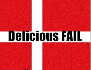

Oh, but the atrocities don't stop there. In fact, there is a whole world out there to cover. If only I had the time to pick on them all. But don't worry, I've saved the worst for last.

Poland. Please, do your countrymen a favor and try to do your part in eliminating the ancient stereotype that your citizens are retards, once and for all. Changing your flag would be a good start.

Northern Marianas has a flag that could only be described as infinitely tacky. I could sit here and stare at it for hours and still not figure out what it's trying to tell me about that particular nation. What is that stone thing behind that giant star? Why the bridal garland ripped off from the local Renaissance Festival? Listen, I'm sure all of this gaudiness is significant to the people of Northern Marianas in some way, but to the casual observer, it looks like something stitched together during arts and crafts hour at a nursing home. Oh, and in case you think I'm getting too cocky, remember that Northern Marianas is an American territory. Marianas needs to do a better job of representing. Just sayin...


Technically, the following flag is not for a specific country. It is for an organization of countries. This is the flag for OPEC. Nevermind that it makes the work of Salvadore Dali and Picasso look completely logical, and that it makes the wrinkled ass of John McCain look nearly appetizing. To me, it looks like four heads, one of which is being eaten alive while the other is running away screaming. I guess is kind of appropriate, though to be more accurate, the bite should be coming out of the ass. OPEC's flag would be cool if it featured Chuck Norris engaged in a sword fight with Charlton Heston, but still it wouldn't even matter. This flag fails just for the fact that OPEC was partially to blame for making me pay nearly $70 to fill up my gas tank. Screw you, OPEC.


The worst offender on this list is miles ahead of all the rest when it comes to making the visual senses nearly vomit. I don't even know where to begin, but Brazil has really done their nation a disservice with this doozy of a flag. The color scheme is putrid. The layout is awkward. What's with all of those stupid stars? And the words across the middle? Very bad form. This fail is bigger than the biggest shaking ass at Carnival.

I'd hate to sound biased. After all, the only flag in this entire blog I've praised so far is the American flag, and some of you might think this is incredibly unfair. But in my research, I found a flag that trumps any other. I don't even need to see the other flags to know this. And why? Because this is the kind of flag that everyone wishes they had. Especially someone like me. Libya, you may be full of insane people and are on my personal Top 5 List of countries in which I fear being stuck. But no matter. Your flag is fucking genius. Oh yes, some might call it a tad plain. Perhaps uninspired. Empty, Spartan, or downright depressing, even. But no... your solid green field with absolutely nothing on it is the pinnacle of flaggy awesomeness. It means I can make your flag say anything I want it to say. It's so ironic, really, from a country not particularly heralded as a bastion of freedom, that your flag allows me to have so much of it! Here's my tip of the hat to you, Libya! Hope you like the falafel.